5 Things I Like About Little Machine Beer
We’ve recently been working with Little Machine, one of Denver’s best breweries. Located on Federal Blvd. near Mile High Stadium, owners Kris and Brett and their team and their dedicated regulars recently celebrated 8 years in business, and the team wanted to update their online presence so that it better matched the unique and amazing spirit of the bar.
We worked with Kris and Brett to launch a new website at the beginning of this new year, as well as a corresponding social presence. I thought I’d let you in on a little bit of the behind-the-scenes of how a branding project works when you’re starting with a pretty awesome brand in the first place.
Here are 5 reasons I like Little Machine:
1. The Beer
I first met Brett when I tried out for his band Dirt about a decade ago, and lucky me I made the cut. At the time Brett was brewing for Dry Dock, and I frequently picked his brain about craft beer. Brett is a true craftsman with a well-earned philosophy on brewing beer, and also a very clear voice about the craft beer industry. For example, instead of entering beer competitions these days, there’s a Little Machine race car:
I’ve never heard Brett actually say anything negative about someone else’s beer, even when I’ve pressed him to try. I’ve heard him analyze the output capacity of a brewery’s system and compare that to what he thought they must pay for rent and say that they needed to adjust their pricing, and I’ve heard him say that the way to get really good at a given beer style is to brew it again and again with a lot of different variables in a way that implies someone else may not be doing that, but he’s always maintained a balance of honesty and positivity when discussing his peers (at least with a civilian like me).
Little Machine’s beer, to me, is about balance, variety, and drinkability. There are new releases every Friday, and there are always different styles on tap for different tastes. Don’t get me wrong, I like breweries that have ten types of New England IPAs or that make really extreme or inventive beers too, but I do think there’s a difference between breweries where I order tasters and breweries where I order pints.
I have never not enjoyed a beer at Little Machine. Some of my favorites include Razz Against the Machine / The Remix raspberry sour, Secret World gluten-free saison, and the always-refreshing Sir Veza Mexican-style lager.
2. The Taproom
One thing I definitely appreciate about Kelly is that when we visit a new place she knows that I’m going to want to check out at least one local brewery, and she’s always been game. Visiting breweries is fun because of the beer, obviously, but also because of the vibe and the art and the decor, and since these are some of Kelly’s specialties she has helped me to see that there are few breweries who do this well, some who try and do some of it well, and far more who don’t really try.
When I walk into Little Machine I feel better, because they do it well. The main bar is round, creating an immediate sense of camaraderie and equality. The people working there, led by Kris, are extremely friendly, and it makes sense because Kris talked specifically in our interview process about her goal to make sure everyone who walks through the door feels like a regular.
Kris and Brett conceive of Little Machine as more than a brewery, more like a neighborhood bar, and it shows. There is art on the walls for sale, there are fun things on the TVs, the events are a blast, and there are always cool people around. I think we did a good job bringing that to life in their new website hero image at www.littlemachinebeer.com as well as in Kelly’s tongue-in-cheek-but-also-exactly-true-for-many-people copywriting: “Little Machine: The Best Bar in the Whole World.”
3. The Kind & Funny Branding
Our job was to get the online persona of Little Machine more in line with its real-life, in-person experience. We started our process like we always do—a fit call to make sure we were all on the same page, and then a two-hour Soul Search interview to get all the details in order to produce a Game Plan document that the four of us reviewed together. We all agreed we were looking to create a brand that showcased community and craft while remaining just a little bit subversive.
Then we got to the real work, which meant spending several days observing the brewery in action, and a whole lot of research for Kelly on Pinterest, Instagram, and other brewery and bar websites.
One afternoon Kelly and I were walking outside, talking about the project, and she said, “I’ve got it, I know exactly what the brand is.” I asked her what she meant but words wouldn’t do her idea justice so instead she immediately turned around to go home and work on it. Several hours later she had a half-dozen inspiration boards, and an inspiration Spotify list to listen to while creating Little Machine’s unique visual identity.
I’d love to share a few of those inspo boards here, but those are proprietary to Little Machine, and too many breweries copy them already, so you’ll have to hire us if you want your own! Just know that it is very, very cool to watch Kelly get hit with a bolt of pure inspiration.
4. The Robot
One of Kelly’s ideas was to go a little surrealist with some things, including an anthropomorphized robot. Little Machine’s established logo is SICK, brilliant in its simplicity and use of negative space and small design touches to create something visually striking:
The risk though, as Kris and Brett told us, is that having a robot as your visual identity can sometimes come off as cartoonish. Kelly wanted to take everything in a more gritty, 70’s-ish kind of aesthetic, and I told her I wanted to take a shot at creating the right robot head for the job.
I thought it might work because Brett and I already had some experience putting people in costumes for the sake of art for Dirt (shoutout Travis!):
I had a pretty clear idea of using road reflectors as eyes and antenna and then a piece of metal as the mouth so you could see out of it, but the rest of it was experimentation, walking through Home Depot and trying to find the right materials and then designing prototypes at home.
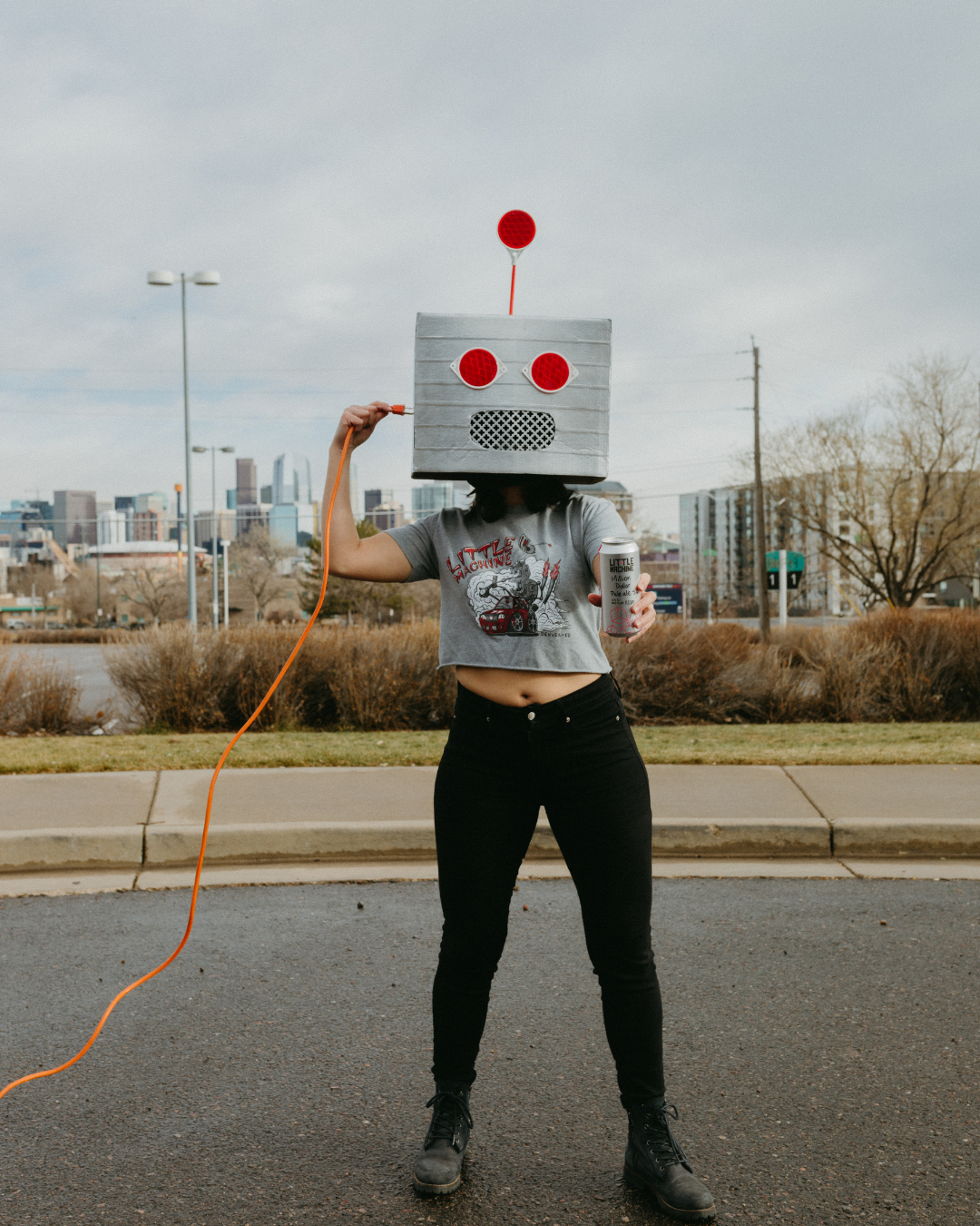
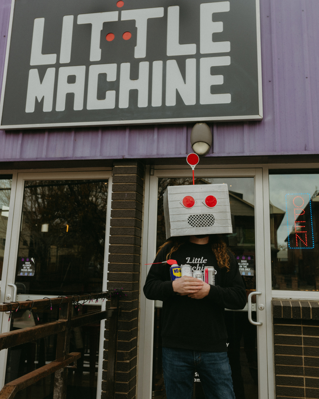
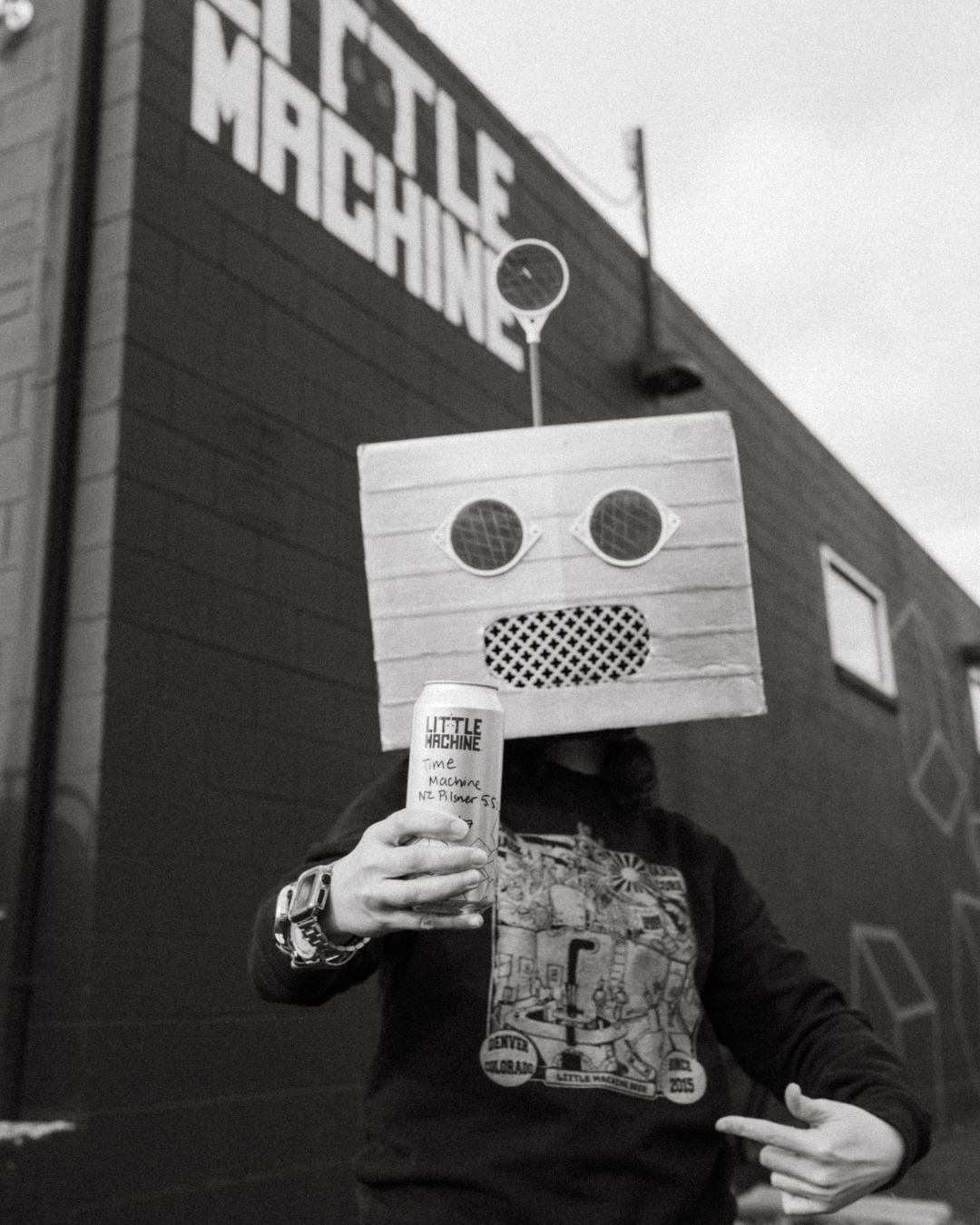
Once it was complete, a brilliant idea from our photoshoot artistic director Lacey to produce visual puns gave us a guide for the shots we’d create, and then Kris and Brett brought energy and personality to the photoshoot, making everything work even better than I could imagine. I love how the mask anonymizes and humanizes, literally demonstrating that people are at the heart of what makes Little Machine special:
5. Working with Visionary Business Owners
Kris and Brett have done an exceptional job over 8 years building Little Machine. They have such a clear vision of who their business is, who their people are, and how they want to show up in the world for that community. They had been doing DIY marketing for so long and had learned what worked and what didn’t, what they were great at and what they were OK at, and where they wanted to go in the future. They were eager to hear our ideas, and they were eager to share their own. They were comfortable speaking up when things didn’t feel right, and provided specific and thoughtful feedback in those instances. I truly feel like we built all of this together, I’m proud of them for taking this step, and I’m honored that they chose us to help them take it.
Want to get a beer with me at Little Machine? I’d love to! Also, here’s one more Dirt video for good measure:


