5 Reasons I Like the Denver Nook and the Sloan’s Lake Agent
I once read that to counteract the damage of one piece of negative self-talk, you have to say five (!) nice things about yourself. If that’s true, I can’t imagine anyone is really celebrating themselves nearly enough, which is why I wanted to turn the lens today on two brands built with Kind & Funny and say some nice things about our own work.
Caitlin Clough, the Sloan’s Lake Agent, and Liz Rossof from the Denver Nook are two real estate agents that we’ve worked with, and like all of our clients, they are really cool. Our job at Kind & Funny is to see that coolness and strategize how to bring it to life in a way that ties into a business’s goals, and I’m hoping to give you a little bit of a behind-the-scenes into how we do what we do by telling you what I think went well for us on these projects. Here are 5 things I like about the work we did with these people on these brands:
1. Caitlin and Liz are badasses
Kel and I often say that our perfect client is a person or business who is amazing at what they do, and these two are perfect examples of why that works for us and for them. Have even a brief conversation with one of them and you can tell that they are dedicated agents who live and breathe real estate. They each came to us with great self-awareness of their unique strengths, the specific categories of homebuyers they love to help, and solid ideas of where they wanted to take their personal brands. A simple piece of marketing advice—think about what you are best at and who needs it most, then talk to those people about it—is a lot easier to follow when the person, product, or business is actually really great.
2. Same industry, different brand personalities
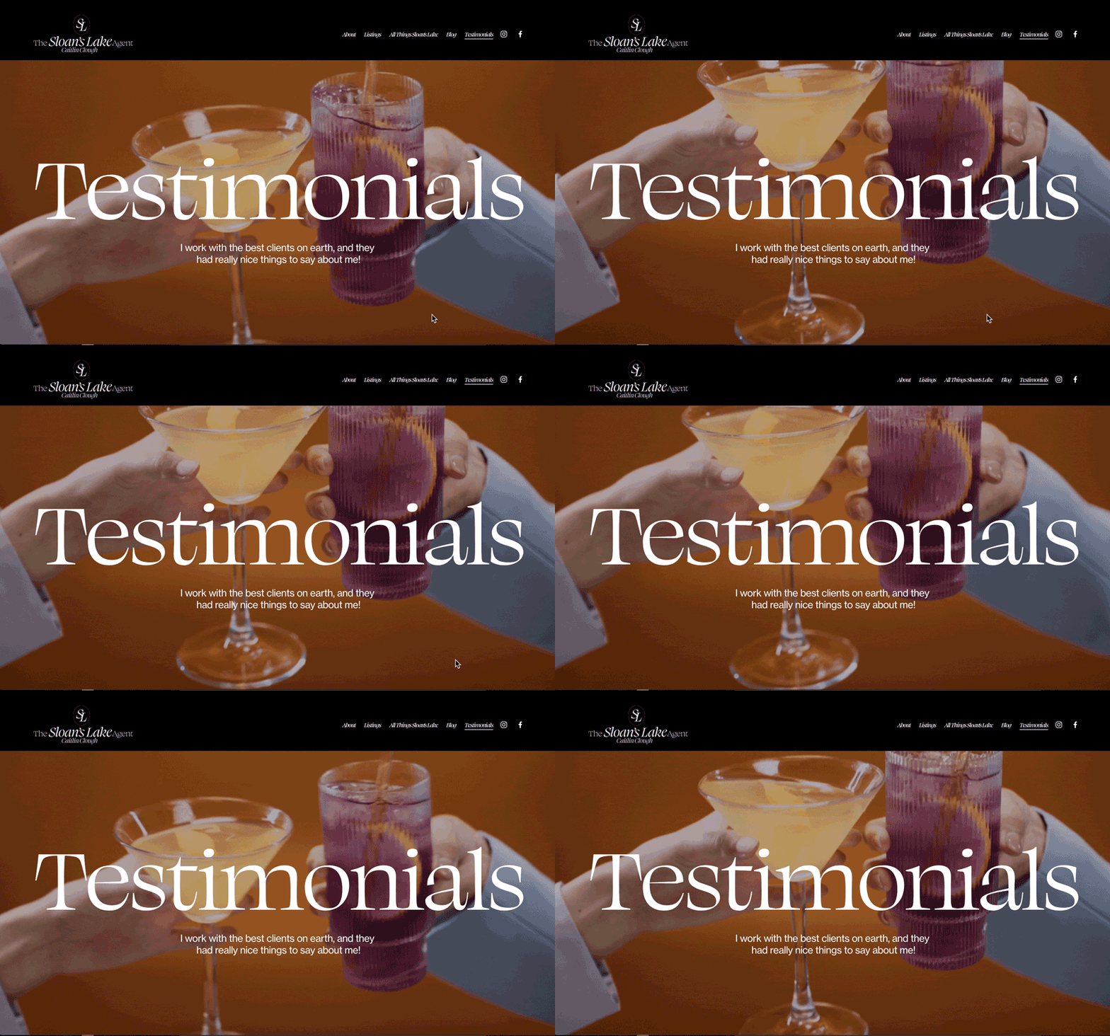
Since Caitlin and Liz are both in the same business, their sites generally have similar jobs to do, so while the underlying site frameworks have a lot in common, Kelly did such a good job of using elements like fonts, imagery, brand voice, written copy, and color palettes to create brands that feel uniquely tailored to each person and each of their distinct target audiences. One of the obvious ways to see that is to simply visit each homepage, www.sloanslakeagent.com and www.denvernook.com, but I think my favorite place this is on display is in the two “Testimonial” pages www.sloanslakeagent.com/testimonials and www.denvernook.com/testimonials. Both are celebratory, conveying the powerful emotions connected with home ownership, but the visual themes are perfectly tailored to each person and to the overall vibe of rest of the website.
3. Liz’s tagline
Time to own my own pride in myself: I wrote the tagline “Where houses become homes” for the Denver Nook, and I love it. It’s efficient (my writing isn’t always), using just four words to do a lot of things: it creates a sense of the Nook as a physical space or state of being through “where”, it incorporates action through the evocative verb “become”, and it calls on the emotional distance between “houses” and “homes” to convey the personal touch you get from working with Liz. It also partners very well with Liz’s personality that is put on display via brand photos staged in partnership with Rachel Grammes, who does an amazing job making photo subjects feel comfortable, therefore letting their true personalities shine through. I like what I wrote, and I especially like it because I think it is on-brand for Liz.
4. Caitlin’s ongoing storytelling
One aspect of Caitlin’s brand building was creating a platform where she could share her authority and expertise with her people. On the Sloan’s Lake Agent blog you’ll find great Caitlin-produced content including the saga of her own family’s pop-top project, regular local market updates, and more personal content like the recent “Authentic October” post that I really enjoyed. It’s frequently a Kind & Funny goal to make sure that the work we do empowers our clients to more easily and efficiently incorporate marketing into their business processes instead of it seeming like a daunting to-do list, and Caitlin has really embraced this aspect of her brand by consistently posting helpful things that show off her knowledge of the neighborhood, the market, and her people.
5. The sites work!
At the end of the day, making good-looking brands is fun and all, but the reason we do it professionally is to help our clients reach more of their ideal clients and hit business goals. Caitlin and Liz have each had clients come to them directly from their new websites, and even better for us is that those clients said it was because of some detail like playing college soccer that helped them know that this specific realtor was the one for them. In businesses like real estate it is so often true that people are hiring you more than they are hiring your service—since Caitlin and Liz were so willing to put themselves out there, we were able to create brands that people can connect with on a more human, more personal level, which I think you can absolutely see if you focus on their about pages at www.sloanslakeagent.com/about-the-sloans-lake-agent and www.denvernook.com/about-denver-nook.
Could you please say 5 nice things about yourself right now?
What’s something you’ve done that you’re proud of, and why?
Need a Kind & Funny brand or marketing plan for your business? You can be the next success story!


